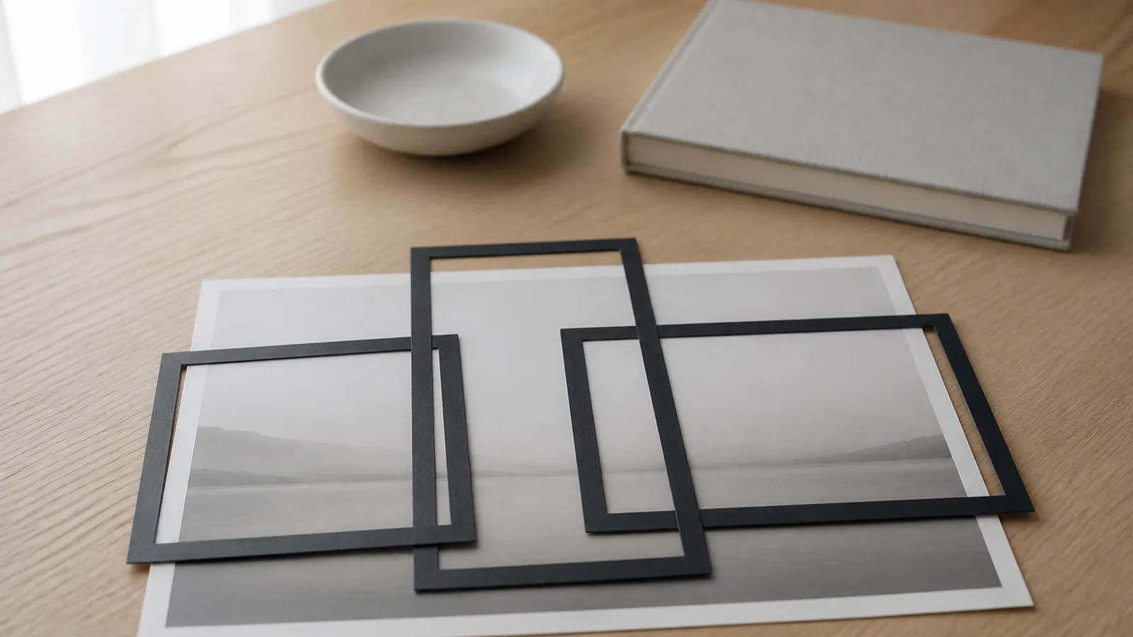
Search for advice on Etsy listing photos and you will be told to use a 4:3 aspect ratio. Etsy used to say that. It does not any more - the line was removed from its help pages between 5 January and 13 February 2026, and what replaced it is more demanding.
Here is what Etsy’s own pages say now, what actually happens to your primary image, and the one setting that about half of sellers never touch.
Your first photo is cropped three different ways
The current wording on Etsy’s image requirements page:
“Make sure that your thumbnail images have enough of a border that they can be cropped to square, portrait, and landscape thumbnails without losing some of the product.” … “Position your image so your subject is clear in all 3 views used across Etsy.”
Three shapes, no numbers. And the shapes are genuinely different across the site: on desktop category browse, listing cards render landscape at 340 x 270 - roughly 5:4, not 4:3 - while market pages have been serving square 300 x 300. Etsy does not publish a per-surface breakdown, and the search results grid specifically is not something we could verify. Anyone quoting you a single precise ratio for “Etsy search results” is guessing.
Which is exactly why the advice moved from a number to a principle: leave margin on every side, because you do not control which shape gets used.
The crop is taken from the centre
Etsy does not document how it crops, so we measured it. We pulled the full-size image and the card renditions for several real listings from Etsy’s image CDN and compared each rendition against top, centre and bottom crops of the source, pixel by pixel.
Centre matched every time, and not marginally: mean pixel difference around 1 to 2 against the centre crop - which is just JPEG noise - versus 21 to 27 against top or bottom. The same held on the horizontal axis. Etsy centre-crops, on both axes, and the effect is what its own advice implies: “This ensures that the center focal point of the image appears in the cropped thumbnail views.”
Practically, this means the top and bottom of your primary image are the parts most likely to disappear, and the middle is the part that always survives. If your product sits low in the frame with a lot of headroom, the landscape thumbnail will cut into it.
About half of listings never adjust their thumbnail
There is a setting for this, and it is easy to miss.
Shop Manager → Listings → edit the listing → Adjust Thumbnail. A slider zooms in and out, you drag to position, and it previews all three views. Apply, and Etsy stores your crop instead of computing one.
You can see which listings have used it. Etsy’s CDN serves two URL shapes: one with no stored crop, where Etsy centre-crops on the fly, and one carrying an explicit crop rectangle with its own x and y origin. On one category browse page we looked at, 32 of 63 listing cards carried a stored crop rectangle and 31 did not. Roughly half of the listings competing on that page are showing whatever Etsy decided.
Two details from Etsy’s own instructions that are worth following:
- “Cropping can change how the thumbnail looks, so try cropping before adjusting your thumbnail.” Do your real crop first, then position the thumbnail.
- “You won’t be able to undo the crop after you save it. To undo the crop, upload the original image again.”
Our free photo cropper does the first step in your browser at full resolution, without uploading anything anywhere.
Etsy says outright that photos affect ranking
Most platforms will not tell you this. Etsy does, in two separate places.
From the search visibility page documentation, listings need to meet certain requirements “for a chance to receive priority placement in relevant search results”, including that the primary photo contains high-resolution images (Etsy recommends 2,000 pixels or more), that it is “a singular image of a finished product (no collaged or stitched together images)”, and that it is “clear and well-lit”.
And more bluntly, from the listing photos page: “Having a main image that is too dark, blurry, or are part of a photo-collage may result in your listing appearing lower in Etsy search results.”
There is one hard number attached to this: your first listing photo should be at least 635 pixels on width and height “to avoid showing up lower in searches”. That is a floor, not a target - the recommendation is still 2,000.
You can audit your own shop against this. Shop Manager has an Etsy search visibility page that filters your listings by image problem, and fixes register within about a day.
Note the scope: this is documented for organic search. Etsy’s page on how ads are placed lists quality-score factors as listing and shop history plus titles and tags, and does not mention images at all.
Three things Etsy prohibits or penalises in the first image
Collages. Penalised for ranking, and Etsy’s handbook explains why in plain terms: “Avoid using collages in your first listing photo, since it can be confusing for shoppers to determine at a glance what’s for sale. It will also serve as a thumbnail and may be hard to see on smaller screens.”
Placeholder-text mockups. For personalised items, Etsy’s Listing Image Requirements policy is explicit: it is prohibited to use a blank product or a mockup with “Your Text Here” placeholder copy as the main image. Mockups are fine in the additional images; the first one has to be the real finished thing.
Watermarks are not banned, but they cost you distribution: “Using watermarks makes photos unsuitable for features within Etsy (like Etsy Finds emails), and ineligible for off-site advertising programs like Google Shopping.” Etsy suggests putting branding inside the scene rather than as an overlay.
The seven shots, and what order to use them in
Etsy’s Seller Handbook names seven photo types: studio, lifestyle, scale, detail, group, packaging and process. It deliberately does not prescribe an order - “you can use any combination of these seven photo types” - but it is clear about which one matters most:
“Your listing’s first photo, the image displayed in search results, is crucial… Your first listing image gets you the click, but those that follow help get you the sale.”
A sensible default, given the crop behaviour above: lead with the studio shot, centred with margin on all four sides. It is the one Etsy describes as what “shoppers browse thumbnail images” are drawn to - clear, bright, unambiguous. Then answer the questions a buyer would ask in order: scale, detail, lifestyle, then variants and packaging.
Our shot list generator turns that into a checklist you can take to the table, per category.
Some numbers worth correcting while you are here
Etsy’s own documentation contradicts itself in a few places, so if you have been working from one page:
- Photo count: the Help Centre says 20 photos and 2 videos per listing. An August 2025 handbook article still says 10. Twenty is right.
- Video length: the listing-creation page says 5 to 15 seconds, the dedicated video page says 3 to 15. Treat 15 seconds as the ceiling.
- Resolution: three different Etsy pages recommend 2,000 px, 2,000 px on the shortest side, and “around 1,500 pixels wide”. Two thousand is the figure the search visibility documentation uses, so use that one.
- Colour profile: Etsy converts images to sRGB rather than rejecting other profiles. Convert first anyway, or the colours you approved will not be the colours that ship.
- File size: there is no published maximum for images, but Etsy warns that files over 1 MB “may not finish uploading” on a slow connection.
- Formats: .jpg, .gif, .png, .svg and .heic only. Animated GIFs are not supported, and transparent PNGs render with the transparent areas in black. That one catches people out badly.
The full current spec, with sources, is in our Etsy photo requirements guide.
If the photo itself is the problem
Everything above is about framing and file handling - the things you can fix in ten minutes without reshooting. None of it helps if the underlying photo is dim, cluttered or shot on a kitchen table, which is precisely what Etsy’s “too dark, blurry” language is aimed at.
That is the part generated product photos exist for: the same item on a clean, evenly lit background, from the angles the seven-shot list asks for, without a studio. Then crop it with margin, centre the subject, and set the thumbnail yourself instead of letting Etsy pick.